Why Homepage Audits Increase Conversions!
Watch the Free Training Video👇
The homepage of a website is always the first point of contact between a brand and those who visit the website. This is where first impressions are created and decisions about potentially buying are formed. If a first impression isn’t a good one, then you might experience lots of people exiting before you even get a chance to win them over. This is why a homepage suit is so crucial.
The Crucial Role of a Homepage Audit
A homepage audit involves a thorough examination of all the touchpoints to ensure the page people land on is well-optimized for user experience and conversions. Think of it as a check up from the doctor to take a look at all the problems you might not even know exist. Examples of this could be your home banner image not having a call to action button, unclear messaging of what you offer is and design elements that are so crucial to the success of your homepage converting.
These are all so important, because every visitor to your website who leaves dissatisfied with how you present your brand and your products is a lost opportunity for a sale. Once you start to optimize your homepage, you’ll see a dramatic decrease in your homepage exit rates and visitors will be more invested in your brand and what you sell, which in return will lead to them making a purchase, either now or in the future.
How to Conduct an Effective Homepage Audit
Conducting a homepage audit isn’t just about critiquing; it’s about breaking down all the elements of your landing page to identify opportunities to better align your website with the expectations and needs of your visitors. Here’s how you can do it effectively:
- Assess User Experience: Look at your homepage from a new visitor’s perspective on both desktop and mobile. Is it inviting? Is it easy to navigate? Does it quickly tell what your brand is about, why you exist, and the outcome of using your product? Is your offer clear?
- Analyze Conversion Elements: Check if your call-to-action buttons are prominent and persuasive. Ensure that your value propositions are clearly articulated and visibly appealing by using text and icons.
- Optimize Content: Evaluate the relevance and quality of the content displayed. It should be engaging, informative, and, most importantly, aligned with what your visitors are looking for.
- Technical Checkup: Ensure your homepage loads quickly and is compatible with all devices, especially mobiles, as a significant amount of web traffic is mobile.
By methodically reviewing and tweaking these elements, you can create a homepage that not only welcomes visitors but also guides them effortlessly towards making a purchase.
The Consequences of Neglecting Your Homepage
Ignoring improvements and optimisations on your website, especially your homepage could be costing you sales. You risk drop-offs and sales by not committing to an audit a couple of times a year. Not doing a homepage audit not only diminishes your brand but it also impacts your marketing spend as every dollar you spend on traffic will be less effective.
In conclusion, a homepage audit is more than a best practice—it’s a critical strategy for any e-commerce business aiming to thrive online. By ensuring your homepage is designed to attract, engage, and convert, you set the stage for lasting business success and a strong online presence.
Lastly, a homepage audit is a best practice for ecommerce for you to profitably grow over time. Making sure your website is optimized to attract, engage and convert visitors will ensure you are maintaining a strong online presence.
So, why wait? Dive into your homepage audit today and start turning those first impressions into profitable conversions. Your e-commerce success depends on it!
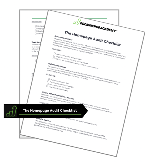
The Homepage Audit Checklist
Get the exact audit checklist to optimise your home page for conversions.
Audit your homepage
Have all the right elements
Create a high-converting homepage

Copyright © Ecommerce Academy


